We're plugging along on the second bathroom project. Dave spent Labor Day laboring over the paint job. We decided to go with a gray wall and white vanity/closet. The photos make the grey look bluer than it is. It's actually a pretty gray-gray. It's Benjamin Moore 2127-50, "Pike's Peak Gray." I like it. We like the colors, but we're not 100% sold on the overall look and whether we'll be able to pull off an updated "feel" without trashing the yellow tub/sink and ugly floor tile. What do you think? I'm currently investigating some other options for resurfacing these elements without having to actually replace them... more on that later. In the meantime, here's how it looks in there now:
Showing posts with label Painting. Show all posts
Tuesday, September 4, 2012
Monday, October 31, 2011
Second Bedroom: Paint
Once again, I must first apologize for the delayed posting. We had us some Internet connectivity troubles (among other small fires--ha!), and as a result, were unable to get to this post until now. These issues appear to be resolved for now, so without further ado, I present to you the Second Bedroom Painting Process/Outcome:
We started out on a Friday night with prepping and priming. We had to bring a bunch of supplies up from our storage locker, move all the furniture, and tape off/tarp the room...
We also decided to prime and paint the baseboards... We had once considered replacing these, to match the new ones in the living/dining room and halls, but with the carpet installation happening out of order thanks to the floor situation over the summer, we just decided this would be easier for now.
On the morning of Day 2 (aka Saturday, aka-College-Football-dictates-painting-schedule-day), we got up bright and early and got to work. For Dave this meant checking the prime-job and adjusting any tape, etc. For me, this meant a first-thing-in-the-morning-trip to our favorite paint store.
This morning also brought to us the discovery of another curiosity left-over from the previous owner. Instead of painting the wooden frame around the sliding doors, our home's former tenant covered them... with duct tape. A lesson for those who like to decorate with duct tape: old duct tape leaves residue behind. Dealing with this requires sanding. Dave also had to sand the wooden door frame:
When I returned from the paint store we got to work on coat #1. Hard to see it, but it's there:
After the Michigan game, we finished coat #2, and then let it dry overnight. Here you have a shot of the finished product, complete with freshly-painted wooden door frame and freshly-hung curtains:
A second outcome of this project was the removal of the ugly old enormous ceiling fan (you can see a shot of it in this round-up post, in the photos of the new carpets), which also turned out to be somewhat of a danger, as it appears to have only been attached to the ceiling by those two tiny stud-screws you can see in the photo below. The search for new lighting starts... now!
We started out on a Friday night with prepping and priming. We had to bring a bunch of supplies up from our storage locker, move all the furniture, and tape off/tarp the room...
![]() |
| (gallery o' |
We also decided to prime and paint the baseboards... We had once considered replacing these, to match the new ones in the living/dining room and halls, but with the carpet installation happening out of order thanks to the floor situation over the summer, we just decided this would be easier for now.
On the morning of Day 2 (aka Saturday, aka-College-Football-dictates-painting-schedule-day), we got up bright and early and got to work. For Dave this meant checking the prime-job and adjusting any tape, etc. For me, this meant a first-thing-in-the-morning-trip to our favorite paint store.
This morning also brought to us the discovery of another curiosity left-over from the previous owner. Instead of painting the wooden frame around the sliding doors, our home's former tenant covered them... with duct tape. A lesson for those who like to decorate with duct tape: old duct tape leaves residue behind. Dealing with this requires sanding. Dave also had to sand the wooden door frame:
When I returned from the paint store we got to work on coat #1. Hard to see it, but it's there:
After the Michigan game, we finished coat #2, and then let it dry overnight. Here you have a shot of the finished product, complete with freshly-painted wooden door frame and freshly-hung curtains:
A second outcome of this project was the removal of the ugly old enormous ceiling fan (you can see a shot of it in this round-up post, in the photos of the new carpets), which also turned out to be somewhat of a danger, as it appears to have only been attached to the ceiling by those two tiny stud-screws you can see in the photo below. The search for new lighting starts... now!
Friday, October 14, 2011
Tuesday, October 11, 2011
Paint Selection: A Process
We are in a saving-for-the-next-big-demo phase here (both bathrooms need re-doing), so all the updates/fixes/tweaks we have planned for the foreseeable future are smaller-scale. This includes (at least): changing light fixtures, stripping remaining wallpaper, scrubbing off wallpaper glue from walls, putting up art, maybe some furniture upgrades, curtains, and painting.
I don't remember paint selection for the three areas already painted (hallway, kitchen, living/dining room) being so stressful. But maybe I've just put it all out of my head because of the intensity of the trauma. Somehow I doubt that. But we can't settle on a color! We can't even come close to narrowing down a color group! Some people know that we've said we're painting the bedrooms several weekends in a row now, and yet somehow, neither bedroom is even taped off or primed at all. That changes this week! We are set and determined to paint at least the multipurpose second bedroom this coming weekend. SET AND DETERMINED! HELL-BENT! It's happening. As you can see, all that has to be done is the selection of a paint color. Here are the paint color chips we've "narrowed" to (for both bedrooms)... Note, we'd like to have the paint purchased before the weekend so we can just get started and finish as quickly as possible... we'll see how that goes:
Here are four general color ranges grouped off:
AAAAAH! Remember: SET AND DETERMINED! HELL-BENT! It's happening.
I don't remember paint selection for the three areas already painted (hallway, kitchen, living/dining room) being so stressful. But maybe I've just put it all out of my head because of the intensity of the trauma. Somehow I doubt that. But we can't settle on a color! We can't even come close to narrowing down a color group! Some people know that we've said we're painting the bedrooms several weekends in a row now, and yet somehow, neither bedroom is even taped off or primed at all. That changes this week! We are set and determined to paint at least the multipurpose second bedroom this coming weekend. SET AND DETERMINED! HELL-BENT! It's happening. As you can see, all that has to be done is the selection of a paint color. Here are the paint color chips we've "narrowed" to (for both bedrooms)... Note, we'd like to have the paint purchased before the weekend so we can just get started and finish as quickly as possible... we'll see how that goes:
![]() |
| (easy to narrow, as you can see) |
AAAAAH! Remember: SET AND DETERMINED! HELL-BENT! It's happening.
Sunday, March 20, 2011
Painted Doors
This weekend's big project was not the mirror - nor was it a big project. We decided to paint the inside side of the front door, as well as that of the door in the kitchen. We have been deliberating on what to do with the kitchen door for a while... At one point we considered buying like-stainless contact paper to cover it... but then thought that could be too much, and somewhat distracting, plus we couldn't find sheets of it that would be wide or long enough to cover the door, so it would have to be done in sections, which would leave obvious seams... Anyway, bad idea. So then we decided we should paint it. But if we were going to paint it, we needed to decide on a color... the wall color? the cabinet color? a contrast color? Conclusion: cabinet color - white. Here's the door before:
And here's the door after:
And once we were talking about painting the kitchen door, we agreed that the front door should be painted, too. The front door looked exactly the same as the kitchen door, except, you might remember it had some odd equation-looking writing etched into the top of it:
We were told by the realtor representing the seller that it was the remnants of a blessing left on the door by a Hungarian priest when the previous owner had the home blessed upon moving in. I have done LOTS of searching to try to figure out what it means, or even if it's truly what he claimed. I haven't found confirmation, but that doesn't necessarily mean anything, I guess. Anyway, I hope it's okay that we covered it!
This is going to be an exciting week at the HSS... we do, actually have a big project starting in a few days... and we'll be excited to share it with you!
![]() |
| (not the prettiest) |
![]() |
| (much better, right?!) |
![]() |
| (19 + G + M + B + 89) |
This is going to be an exciting week at the HSS... we do, actually have a big project starting in a few days... and we'll be excited to share it with you!
Tuesday, March 8, 2011
Living Room
As promised, today I present the painted living room. I mentioned in previous posts that the three paint colors for the connected open spaces (kitchen, hallway(s), and dining/living rooms) were related. The undertone to the kitchen and living room colors (the taupe and the gray) is blue - obviously the hallway is blue. Our idea was to refresh the home and reflect the greatest draw to living here: the water.
Last week we were watching HGTV for a change, and an episode of Designed to Sell provided inspiration. As the possibility of buying a home, and then the very real reality of updating a home, took over our lives, we started paying more attention to design shows, photos, spaces we passed or visited etc. Crown molding has always appealed. However, our ceiling is popcorn-y (sigh), so adding it to this place would look neither smooth/seamless nor elegant at all. So we abandoned the idea. Until the aforementioned DTS episode showed us another option. To create an architectural element, as well as an updated designed detail to the space, the designer added the illusion of molding by painting a thick stripe of white at the top of the room. Both of us reacted thusly, "Oh!" So we entertained the idea of taping off a 5-6" strip from the ceiling down in the living room. It sounded great at first, and then we got nervous. We're not experienced enough with paint to add detail, we thought. This is a little too advanced, we believed. We can't figure out how to keep the paint from bleeding behind the tape consistently, we concluded. And so we dropped it. We could add it later. I went away to a work trip in Nashville, and Dave set to work with slapping the gray (Little Falls) on our living room walls. I came home to a beautiful, fresh looking space. We finished up the second coat on Sunday, and were pleased. It looked great!
Then... Dave was off from work on Monday, and was suddenly re-inspired. No reason not to try the stripe now! He bought Frog Tape (better than the standard blue painter's tape -- again, there will be a separate post soon about the merits of investing in good tape!), thanks to his sister's advice (thanks, Lynn!), and white paint, and... check it out:
Now to put some stuff on these walls! Tomorrow: curtains. And once again, how great is Dave?!
Last week we were watching HGTV for a change, and an episode of Designed to Sell provided inspiration. As the possibility of buying a home, and then the very real reality of updating a home, took over our lives, we started paying more attention to design shows, photos, spaces we passed or visited etc. Crown molding has always appealed. However, our ceiling is popcorn-y (sigh), so adding it to this place would look neither smooth/seamless nor elegant at all. So we abandoned the idea. Until the aforementioned DTS episode showed us another option. To create an architectural element, as well as an updated designed detail to the space, the designer added the illusion of molding by painting a thick stripe of white at the top of the room. Both of us reacted thusly, "Oh!" So we entertained the idea of taping off a 5-6" strip from the ceiling down in the living room. It sounded great at first, and then we got nervous. We're not experienced enough with paint to add detail, we thought. This is a little too advanced, we believed. We can't figure out how to keep the paint from bleeding behind the tape consistently, we concluded. And so we dropped it. We could add it later. I went away to a work trip in Nashville, and Dave set to work with slapping the gray (Little Falls) on our living room walls. I came home to a beautiful, fresh looking space. We finished up the second coat on Sunday, and were pleased. It looked great!
Then... Dave was off from work on Monday, and was suddenly re-inspired. No reason not to try the stripe now! He bought Frog Tape (better than the standard blue painter's tape -- again, there will be a separate post soon about the merits of investing in good tape!), thanks to his sister's advice (thanks, Lynn!), and white paint, and... check it out:
![]() |
| (forgive the clutter... next time you see this space it'll be put back together better!) |
Monday, March 7, 2011
Front Hallway and Signs of Life
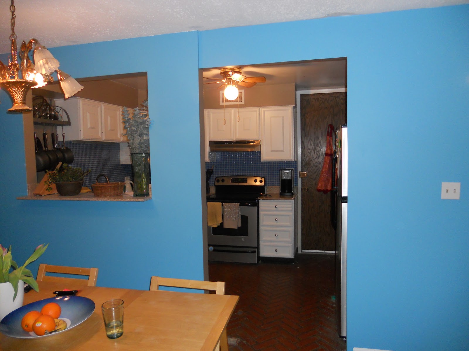
I apologize for the delayed conclusion to our hallway painting pre-post. Between required touch-ups to the paint job (look for a future post on painter's tape) and travel (me, for work), we decided to clean up the whole job and put some stuff on the walls so that when we did get around to posting, there'd be much greater impact (I love drama!). To that end... we finished up the hallway painting with what I would say is great success. The blue was... well, very blue at first, but I still loved it. I think part of the "wow!" of it all was just how different it was from what it had been. The decision to paint the dining side of the new wall was a good one. The blue and the taupe in the kitchen complement each other really nicely, so when you're looking through the new pass-through window, it looks great! And now that we've lived with it for a bit, I think the blue really works. We have also now painted the living room (with a cool detail... more on that tomorrow), and the whole thing together looks beautiful (I/we think, at least!).
As to the "signs of life" referenced in the title of this post, we have finally, as of last night and tonight, put our first things on the wall! It started with our hooks for our keys, which I put up last night, just to have done it. And tonight, we put up two new picture shelves in the front hall, and even pulled out, dusted off, and put up some of our framed art! Not sure if this bunch of photos/art will stick, but we just wanted to see something up -- a little bit more of us in this place, finally.
And so, without further ado... I present the hallway/accent wall conclusion:
Finally, I'll give you a little preview to tomorrow's post on the living room. The color we picked is a gray called "Little Falls." It has blue undertones and is from the same family of colors as the taupe in the kitchen and the blue in the hall. Having it up makes the blue make more sense, and helps with the flow. I mentioned above that we decided to add a detail, and I have to say, it's impressive. Go Dave! So, more on that tomorrow, but in the meantime, here's the corner where the living room meets the blue dining wall:
As to the "signs of life" referenced in the title of this post, we have finally, as of last night and tonight, put our first things on the wall! It started with our hooks for our keys, which I put up last night, just to have done it. And tonight, we put up two new picture shelves in the front hall, and even pulled out, dusted off, and put up some of our framed art! Not sure if this bunch of photos/art will stick, but we just wanted to see something up -- a little bit more of us in this place, finally.
And so, without further ado... I present the hallway/accent wall conclusion:
![]() |
| (front entrance - duh) |
![]() |
| (hallway, up to the master suite door) |
![]() |
| (dining side of the new wall -- now an accent wall!) |
![]() |
| (window pass-through between the dining room and kitchen - how do the colors look together?) |
![]() |
| (yes, we hang our keys on two dog-butts, thanks to my T! btw, they're from IKEA) |
![]() |
| (too much? too busy? okay? whatever, for now we're just happy to have something up!) |
![]() |
| (intrigued?!) |
Saturday, February 26, 2011
Hallways/Dining Wall Paint Teaser
I'm more than a little excited about this paint color -- as soon as we put up our first patch, I was *nearly* squealing, it looked so good! In a matter of moments, the entryway was already transformed, and everything is looking so fresh and bright and new. I have to thank my dear friend, P(C)M for encouraging this choice. On the swatch it was just a number, but thanks to the label on the paint can, I can tell you that this is called "A Patch of Blue" (and it's a winner!):
I'll leave the "After" photos for when the second coat is up tomorrow, for more impact! (Mwahahahaha!)
More tomorrow...
![]() |
| (The "color"-ness of it made me a bit anxious at first, but trust me, it looks fantastic!) |
I'll leave the "After" photos for when the second coat is up tomorrow, for more impact! (Mwahahahaha!)
More tomorrow...
Painting - Hallways and Dining Room Accent Wall
I knew we'd finally start talking about something besides the kitchen! This weekend we're painting the front hall, the hallway through to the Master Suite, and the other side of the new wall between the dining room and the kitchen. Before we get started, I just wanted to give some perspective...
You may recall that upon move-in, our front hall was wallpapered like this:
And then we peeled it off to reveal this:
So that was Before... this is Middle:
And soon we'll be able to show you After!
Originally we were going to paint all of the living room and dining area one (same) color, but we've changed our minds and are painting the dining room side of the new kitchen wall the same color as the halls. The idea is that this will create an accent wall, as well as connect the three physically connected areas (halls, kitchen, dining/living rooms). The three colors we've chosen for these spaces all tie together, so hopefully this will also help to blend the spaces more seamlessly (we hope!)... Now, on to priming away that minty green wall!
You may recall that upon move-in, our front hall was wallpapered like this:
And then we peeled it off to reveal this:
![]() |
| (minty!) |
And soon we'll be able to show you After!
Originally we were going to paint all of the living room and dining area one (same) color, but we've changed our minds and are painting the dining room side of the new kitchen wall the same color as the halls. The idea is that this will create an accent wall, as well as connect the three physically connected areas (halls, kitchen, dining/living rooms). The three colors we've chosen for these spaces all tie together, so hopefully this will also help to blend the spaces more seamlessly (we hope!)... Now, on to priming away that minty green wall!
Sunday, February 6, 2011
Painting! (Day 1)
Yesterday was Painting Day 1. We thought tackling the painting of the kitchen would be fairly straight-forward. Prime in the morning, wait an hour or two, then apply the first coat and you're done for Day 1. Day 2 all you'd have to do is apply the second coat and relax. Not so simple. I made three separate trips to the paint store yesterday. I have to give another shout out to the guys over at Thybony Paint in Andersonville. Not only are they the most knowledgeable and helpful people, but they are just kind, and just a great local business that I'm proud to support. The first trip was right before we primed. We needed another roller, extra roller replacements, more paint stirrers, and additional brushes for edging and corners. So while Dave expertly taped off the kitchen, and boxed up everything on the shelves (again!), I hopped over to Andersonville. Easy. Got what I needed, came home, put on my painting clothes, and joined Dave in the kitchen. Voila! We're primed:
After the primer dried, and Lanie'd had a good walk, we got everything ready to start applying the first coat of actual paint. Dave got out the paint to start stirring it up, and it just didn't look right. There was a layer of watery something on the top, and stirring it did little to make it look convincingly good. Too thin, to liquidy, and certain to create a mess. We stopped, packed it back up, and I jumped back in the car to bring it over to Thybony to see what they thought. They agreed something wasn't right, but thought that whoever had originally mixed it for us hadn't shaken it enough. It went back in the shaker and looked a little better. So, they suggested I take it home and try it, and if it was still too thin, to call them and they'd prepare another can (of better quality! and at no cost!) paint for me to come swap it out for. Home I went, and sure enough, taupe-y water was what awaited us, so I called, gave them the paint color, and rushed back over (they were closing) to pick up another can of Ticonderoga Taupe (Benjamin Moore #992 - that's for our records). They had it ready, and were waiting for me, even though the store was closed. So home I went again, and we got to painting. At the end of Day 1, the kitchen already looked great. I'll save the full-reveal for tomorrow after we've pulled all the tape off and put everything back on shelves and in its place, but here's a small taste, mess and painting supplies intact, of what it's looking like:
We've just now finished with coat #2, and it looks fantastic! Full-effect tomorrow... stay tuned!
After the primer dried, and Lanie'd had a good walk, we got everything ready to start applying the first coat of actual paint. Dave got out the paint to start stirring it up, and it just didn't look right. There was a layer of watery something on the top, and stirring it did little to make it look convincingly good. Too thin, to liquidy, and certain to create a mess. We stopped, packed it back up, and I jumped back in the car to bring it over to Thybony to see what they thought. They agreed something wasn't right, but thought that whoever had originally mixed it for us hadn't shaken it enough. It went back in the shaker and looked a little better. So, they suggested I take it home and try it, and if it was still too thin, to call them and they'd prepare another can (of better quality! and at no cost!) paint for me to come swap it out for. Home I went, and sure enough, taupe-y water was what awaited us, so I called, gave them the paint color, and rushed back over (they were closing) to pick up another can of Ticonderoga Taupe (Benjamin Moore #992 - that's for our records). They had it ready, and were waiting for me, even though the store was closed. So home I went again, and we got to painting. At the end of Day 1, the kitchen already looked great. I'll save the full-reveal for tomorrow after we've pulled all the tape off and put everything back on shelves and in its place, but here's a small taste, mess and painting supplies intact, of what it's looking like:
![]() |
| (I love it with the blue tile!) |
![]() |
| (original plan was to leave the shelves white, but we changed our minds... I think it'll look great!) |
Subscribe to:
Posts (Atom)


